When to use bar charts
Use bar charts to compare size
Figure 1: Favourite animals of 6 year olds, UK, 2022
 This figure shows a bar chart displaying the fictional data of favourite animals of 6 year olds. The bar chart shows the small differences between the categories. It is easy to compare the sizes of the bars.
Source: fictional data
Use bar charts for ranking and deviation
Bar charts can be used to show data ranked in ascending or descending order. We should always rank bars by value, unless there is a natural order, for example, age or time.
We can also use bar charts to show how data differs from a fixed value. For example, you can show how data from different categories compares with an average, or the percentage change for different groups.
Figure 2: Two charts showing median house prices in different areas of Wales and how they compare to the overall median for Wales, year ending March 2022
 The figure shows two bar charts. One shows the median house price paid in each Welsh local authority ranked to compare with median house price for all Wales. The other shows how the median price paid in each Welsh local authority differs from the median for the whole of Wales.
Whether you show ranking or deviation will depend on the message you want to get across.
Source: Median house prices for administrative geographies from the Office for National Statistics
Use bar charts to show a distribution
Bar charts may also be used to show distribution. If used for this we should use narrow bars with small gaps to show how data is distributed across a range. A common example is a population pyramid.
Example:
Interactive population pyramids from the Office for National Statistics (link opens in a new tab)
Formatting bar charts
Do not use 3D bar charts
Figure 3: Three fictional bar charts comparing 2D and 3D bars

The figure shows three bar charts of fictional data. One is a simple bar chart, the others are 3D alternatives. The simple bar chart has a green tick next to it. The 3D bar charts have red crosses next to them.
We advise never to use 3D bar charts because:
- it is much harder to read accurate values from a 3D chart
- presenting bars at different depths makes it harder to compare size
Gaps between bars
Figure 4: Favourite animals of 6 year olds, UK, 2022, presented in three different ways
 The figure shows three bar charts of fictional data with different size gaps between the bars.
Source: fictional data
This illustrates that:
A gap that is slightly narrower than the width of a single bar is the best when using bars to make size comparisons.
While big gaps make comparisons harder and should generally be avoided, small gaps may be useful if you’re showing distribution – for example, a population pyramid.
Demonstration video
Watch this video to see how to change the size of gaps between bars in Microsoft programs
I’m going to go through how to change bar gap widths.
I’ll be using PowerPoint, but the steps will be similar if not the same when using other Microsoft programs.
First, select the bars so they are all highlighted. Then, right click and select ‘Format Data Series’. In the panel which appears on the right, under ‘Series Options there is ‘Gap Width’.
We can then use a slider to increase or decrease the gaps between the bars. Or we can type numbers into the box to get specific gap sizes. Today I’ve used 55% because we recommend that gaps should be slightly narrower than the width of a single bar.
Data labels
Adding data labels to charts is essentially combining a table and a chart together on one display.
They may cause too much visual clutter. But, they can be useful and there is evidence that users like them.
The presentation of them can be tricky.
Figure 5: Number of visits lasting at least one night in 2021, top 20 UK cities or towns, excluding London

The figure shows the same bar chart in two ways: one with data labels on the base of the bars and one with the data labels just after the end of each bar. Both show the most popular town or city to visit for at least one night (excluding London) was Manchester with 307, 000 visits, followed by Edinburgh (261,000) and Birmingham (208,000).
Source: International Passenger Survey 2021 from the Office for National Statistics
Putting labels on the base of the bars can cause problems with colour contrast and sometimes labels do not fit on smaller bars.
One alternative is to put labels just outside the end of the bars. But this can cause issues when text runs over gridlines. It also means the numbers are not aligned as not all bars are the same length. This makes it harder to compare numbers.
Data labels: conclusion
There is no perfect answer to presenting data labels.
It is a good idea to test your charts with users. For example, in this Twitter poll (link opens in a new tab), data labels on the end of bars came out as the favourite type of presentation.
But this may not always be the case, it will depend on the chart and the user.
Do not use data labels when you have more than one series on a chart. This would definitely risk the chart becoming too cluttered.
Quick practice on adding data labels (PPTX, 53KB).
This activity shows you how to add data labels to charts in Microsoft Office programs.
Please email Analysis.Function@ons.gov.uk if you have any problems accessing or using this file.
Colours
Colour helps the brain quickly identify differences, but using lots of colours makes this harder.
Think carefully before you introduce additional colours into a graph. Ask yourself:
- do you really need the colours?
- do they make your message clearer?
When people look at a chart with lots of colours, they try to work out what those different colours mean. If colours suggest meanings that are not there the user will waste time and effort trying to understand them.
Users are also more likely to compare bars when they look alike than when they look different.
Figure 6: Bar charts showing fictional data on profits for six companies, presented in two ways
 The figure shows two bar charts of the same fictional data on ‘Profit of six companies’. One uses a different colour for each bar, this has a red cross next to it. The other uses one colour for all bars, this has a green tick next to it.
These charts illustrate that you should only use colour when it is needed.
Start bars at zero
We advise that bars on bar charts should always start at zero.
When people stray from this rule it becomes problematic and potentially misleading.
Example: Two bar charts of the same data about ‘Obamacare’ enrolment
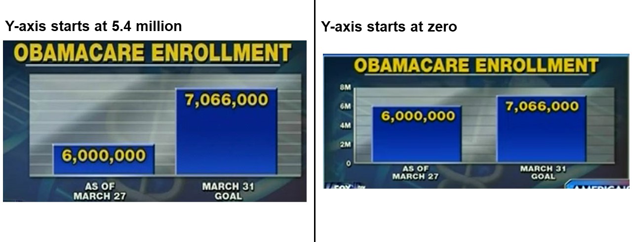
This image shows screenshots of two vertical bar charts showing the same data about ‘Obamacare’ enrolment. They compare the enrolment levels on 27 March (6 million) with the goal to be reached on 31 March (7.066 million). One has a y-axis starting at 5.4 million, the other has a y-axis starting at zero.
Source: Fox News via Media Matters website
When bars do not start at zero, the distance between bar height or length is exaggerated.
Charts like these can get lots of criticism, even if they are not intentionally meant to mislead.
If you wish to draw attention between the size of the bars and are tempted to use a bar chart with a broken axis it is better to use a dot plot. This blog post from the ONS Digital team gives a good summary of this issue. This Twitter discussion also demonstrates the issue well as does this tweet from the Office for Statistics Regulation.
Quick practice on changing the y-axis minimum (PPTX, 52KB).
This activity shows you how to set the y-axis minimum to zero in Microsoft Office programs. It also allows you investigate how a bar chart looks when you change the y-axis minimum bound.
Please email Analysis.Function@ons.gov.uk if you have any problems accessing or using this file.
Maximum on axes
In some cases we should also consider the maximum for the axes. For example, when talking about percentages. If an axis only goes to 30% or 70% we may be showing a misleading visualisation of the data. We should also consider annotation if there are specific targets to meet.
Example
Figure 7: Percentage of women Members of Parliament (MPs) elected at UK general elections, 1918 to 2019, option 1
 This horizontal bar chart shows the percentage of women MPs elected at UK general elections from 1918 to 2019. The percentage has risen from 0.1% in 1918 to 33.8% in 2019 with most of the increases coming after 1987. However, the x-axis only goes to 40%. This is the default axis maximum when creating this chart using Microsoft Office programs.
Source: General Election 2019: How many women were elected? From the House of Commons Library
This is potentially misleading as, if a user did not consider the x-axis properly, the long bars at the bottom of the chart could suggest that the proportion of women MPs is nearing 100%.
Figure 8: Percentage of women MPs elected at UK general elections, 1918 to 2019, option 2
 This is the same data as shown in figure 7 but this time the x-axis goes to 100%.
This gives a better indication of the proportion of MPs who are women. But there is a lot of white space on the chart.
Figure 9: Percentage of women MPs elected at UK general elections, 1918 to 2019, option 3
 This figure shows the same data as in figure 7 but this time the x-axis goes to 50%.
Annotation has also been added next to a line highlighting the 30% gridline. The annotation reads: “The United Nations calls on governments, political parties and others to adopt a 30% minimum proportion of women in leadership positions.”
The x-axis going to 50% gives a better indication of equality than in figure 7 but avoids the large white space seen in figure 8. The annotation draws attention to the scale of the x-axis. It also helps users see the UK is not far past the suggested United Nations minimum for women in leadership positions and only met it in 2017.
Bars and time series
A time series is a series of data points given over certain time period. In general we use line charts for time series.
Bar charts can be useful for showing time series when there is one series of data. When we have more than one time series, line charts are better.
Example: one time series
Figure 10: Fictional time series data presented as a bar chart and line chart

The figure shows two charts of the same fictional time series data for England. One is a bar chart and one is a line chart. Green ticks are next to both.
When there is one time series, a bar chart and a line chart are equally good at showing a trend over time.
Example: two time series
Figure 11: Fictional data of two time series presented as a bar chart and line chart
 The figure shows two charts of the same time series data for England and Wales. One is a bar chart and one is a line chart. A red cross is next to the bar chart, a green tick is next to the line chart.
When there is more than one series it is easier to see trends on a line chart.
Quiz
Try these questions to test your knowledge from this module
Download a plain text version of module 5 quiz (ODT, 9KB)