What is data visualisation?
Data visualisation is the visual presentation of numbers.
Types of data visualisation
- Charts.
- Tables.
- Maps.
- Infographics.
Note: for the purposes of this e-learning when we talk about tables, we mean demonstration tables which are short tables used within a publication. We do not class tables in spreadsheets used for reference alongside publications as data visualisations.
Drag and drop exercise
Drag and drop the images into the correct categories.
Sort the examples into “examples of data visualisations” or “examples which are not data visualisations”.
- A bar chart displaying the fictional data of favourite animals of 6-year-olds. The bar chart shows the small differences between the categories.
- A clustered bar chart showing fictional data on levels of stock of different fruit across four shops.
- A spreadsheet of the top names for baby boys, England and Wales, 2021
- A line chart of time series data showing the highs and lows of the unemployment rate. It shows the fluctuations of the rate between a high of just under 12% in the early 1980s and a low of just under 4% in 2019.
- An R script of code from RStudio for creating a chart.
- A pie chart showing fictional data of whether questions in a Maths exam were answered.
- A tree map with five segments showing the percentage five sectors (drinks, clothes, electronics, food, and books) contribute to profit, in a fictional retail company.
- A spreadsheet file of standardised mean age of mothers and fathers, England and Wales, 1938 to 2021 opened as a text string.
- A table of people employed at each Civil Service grade in the UK in 2018.
Examples of data visualisations:
1. A bar chart displaying the fictional data of favourite animals of 6-year-olds. The bar chart shows the small differences between the categories.
2. A clustered bar chart showing fictional data on levels of stock of different fruit across four shops.
4. A line chart of time series data showing the highs and lows of the unemployment rate. It shows the fluctuations of the rate between a high of just under 12% in the early 1980s and a low of just under 4% in 2019.
6. A pie chart showing fictional data of whether questions in a Maths exam were answered.
7. A tree map with five segments showing the percentage five sectors (drinks, clothes, electronics, food, and books) contribute to profit, in a fictional retail company.
9. A table of people employed at each Civil Service grade in the UK in 2018.
Examples which are not data visualisations:
3. A spreadsheet of the top names for baby boys, England and Wales, 2021
5. An R script of code from RStudio for creating a chart.
8. A spreadsheet file of standardised mean age of mothers and fathers, England and Wales, 1938 to 2021, opened as a text string.
We class line charts, clustered bar charts, demonstration tables, bar charts, pie charts and tree maps as types of data visualisation. They are visual presentations of numbers.
We do not class spreadsheets, R script code and spreadsheets opened as a text string as data visualisations.
Why visualise data?
We visualise data to:
- present complex information simply
- improve engagement
- make data easier to understand
- communicate numbers in a non-technical way
- give an overview or summary of a dataset
- communicate memorable or important stories in a dataset
- reveal insight that would otherwise be hidden
It is also useful for quality assurance and error detection.
This tweet has a graphic showing how a set of data points with the same summary statistics can make different images on a scatter chart. It shows 13 of these images. These include a T-rex, a star, a circle and a cross. It explains why visualising data is always a good thing to do:
The Datasaurus Dozen! While different in appearance, each dataset has the same summary statistics (mean, standard deviation, and Pearson’s correlation) to two decimal places. https://t.co/efQyCvCe4T pic.twitter.com/lNZc6Ro8kg
— Mara Mather (@MaraMather) September 3, 2022
If you are having issues accessing the tweet, please have a look at this article on the Datasaurus Dozen instead.
What happens when data visualisation goes wrong?
Example 1
Figure 1: Infographic on benefit cap from the press office of the Department for Work and Pensions (DWP)

This looks like a simple data visualisation from the press office of the Department for Work and Pensions (DWP).
It shows that 50,000 households have had their benefits capped since April 2013.
It also states that more than 12,000 households have made the choice to move into work or stop claiming housing benefit because of the benefit cap.
Problems
Firstly the houses look like they are representing the numbers. This is problematic as the house representing the 50,000 figure is smaller than the house representing the 12,000 figure.
Secondly they state that 12,000 households have moved into work or stopped claiming housing benefit because of the benefit cap.
This is problematic as it is stating the benefit cap has caused the change, which cannot be proved with the data they have.
Consequences
This tweet was picked by the Data Visualisation Team at the Daily Mirror.
They tweeted an image with the text: “Hey DWP, we fixed your graph for you”. The Daily Mirror tweet went viral and it suggested DWP were deliberately trying to mislead.
Figure 2: Infographic on benefit cap redrawn by Data Visualisation Team at the Daily Mirror

In this image, the houses are sized relative to the numbers they represent. The 12,000 households who have moved into work or stopped claiming housing benefit is shown relative to the 50,000 households who had their benefits capped. The text stating changes happened because of the benefit cap has also been removed.
Example 2
The Department for Health and Social Care (DHSC) tweeted a chart about nurses’ pay:
The tweet said:
“NHS nurses received a pay rise of at least £1,400 this year, on top of a 3% increase last year.
We’re grateful for their hard work and regret that some union members have voted for industrial action.
More details on how nurses’ pay has gone up.”
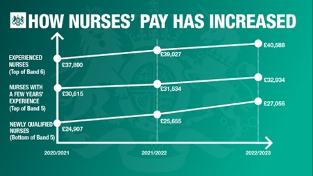
The image in the tweet was a line chart with the title ‘How nurses’ pay has increased. The x-axis displays year ranges starting with 2020/2021. The y-axis appears to display annual incomes of nurses starting just below the lowest value of £24,907 but does not have any values on this axis.
The graphic shows how nurses’ pay has increased.
Experienced nurses (top of Band 6).
- From 2020 to 2021 £37,890.
- From 2021 to 2022 £39,027.
- From 2022 to 2023 £40,588.
Nurses with a few years’ experience (top of Band 5).
- From 2020 to 2021 £30,615.
- From 2021 to 2022 £31,534.
- From 2022 to 2023 £32,934.
Newly qualified nurses (bottom of Band 5).
- From 2020 to 2021 £24,907.
- From 2021 to 2022 £25,655.
- From 2022 to 2023 £27,055.
Problems
It is a line chart with a y-axis that does not start at zero but this is not made clear. The y-axis also appears to be distorted and the source data was not signposted or linked to in the tweet.
Consequences
An MP complained about this chart to the UK Statistics Authority who replied in a letter criticising the chart.
Sir Robert Chote (the chair of the UK Statistics Authority) criticised the lack of transparency around the y-axis, the lack of source data and the apparently “freehand” way the lines had been drawn. He said:
“I agree that this is a poor and misleading representation of the underlying data that risks damaging public confidence in the presentation of official statistics by the department.”
He supplied a new image of the chart.
Figure 3: Chart of nurses’ pay between 2020 and 2023 redrawn by Sir Robert Chote

The new chart Sir Robert Chote supplied had an accurate y-axis starting at zero. The lines have been redrawn over the original chart to match the accurate scale on the new y-axis. The slope of the line showing pay for newly qualified nurses is noticeably less steep.
Lessons to learn
Data visualisation is a very useful way to communicate a message.
But, if not done well it can cause reputational damage and potentially a loss of public trust.
Quiz
Try these questions to test your knowledge from this module.
Download a plain text version of module 1 quiz (ODT, 8KB)