Accessibility: what is it and why should we address it?
“Web accessibility means that websites, tools, and technologies are designed and developed so that people with disabilities can use them. More specifically, people can: perceive, understand, navigate, and interact with the web.”
World Wide Web Consortium
We need to make our content accessible so that it can be accessed by as many users as possible regardless of health conditions or impairments.
Content on public sector websites that does not meet the Web Content Accessibility Guidelines 2.2 can get complaints related to the Public Sector Bodies (Websites and Mobile Applications) Accessibility Regulations 2018 and/or the Equality Act 2010.
This means inaccessible content can, and has, resulted in legal action. Read more about consequences of inaccessible content in our ‘Accessibility legislation: what you need to know‘ guidance.
What this guidance covers
This guidance aims to help producers of government analysis and statistics meet the UK accessibility regulations.
It does not cover everything you could do to make content accessible. Assistive technology is always adapting and research into barriers disabled people face is increasing. We will update this guidance to reflect new findings.
The guidance does not cover technical aspects of a website such as buttons, online forms and colour contrast in website branding.
Depending on where you publish your content you might have specific guidance to follow. For example, the Government Digital Service (GDS) has guidance for publishing on GOV.UK. Similarly, the Office for National Statistics (ONS) has guidance for publishing on the ONS website.
We try to highlight differences between the GDS and ONS guidance when appropriate. We also try to make it clear when the guidance is directly linked to the accessibility regulations or simply best practice.
Remember, legally, if you publish content on a public sector website, you must meet the A and AA success criteria on the Web Content Accessibility Guidelines (WCAG) 2.2. For more information on this please see our guidance on ‘Accessibility legislation: what you need to know’.
Making written content accessible
This advice will align to most website style guides but remember to check the specific style guide for the website you are publishing on.
Some of the advice here is best practice and some is specifically mentioned in the accessibility guidelines which support the accessibility regulations. We have noted when the latter is true.
Remember, generally speaking, anything that improves consistency across a website makes it more accessible.
Expand acronyms and abbreviations when you first use them.
This is success criterion 3.1.4 abbreviations (AAA level).
Example of bad practice
This seminar is the latest in a series organised jointly by the RSS, the RES, ESCoE, ONS and the SPE.
Example of good practice
This seminar is the latest in a series organised jointly by the Royal Statistical Society (RSS), the Royal Economic Society (RES), the Economic Statistics Centre of Excellence (ESCoE), Office for National Statistics (ONS) and the Society of Professional Economists (SPE).
Notes
The Government Digital Service (GDS) states that you can use an acronym on GOV.UK without expanding it on first use if you can prove that 80% of the UK population will understand it without the full version. Examples include: BBC, NHS, PhD and MSc.
Do not use full stops in abbreviations. For example, use BBC, not B.B.C.
If a page is very long, expand acronyms on their first use within each section as users often skim read and skip to sections lower down.
Bold text
Bold text does not fail accessibility standards and the British Dyslexia Association recommends using bold to highlight text for people with dyslexia. On the other hand, bold text used for emphasis can sometimes make content difficult to read for people with visual impairments.
Using bold text for emphasis is not permitted on GOV.UK.
Please check the style guide for the website you publish on.
Italic and underline
Do not use italic fonts or underline words to draw them out of text. This makes content hard to read for people with dyslexia. The only things you should underline are hyperlinks.
Be consistent in presentation of bullet points. We recommend the GDS style guide advice for bullet points.
Too many capital letters make sentences hard to read, particularly for people with dyslexia.
We recommend you follow the GDS style guide advice on capitalisation.
Avoid using negative contractions such as ‘can’t’ or ‘don’t’.
These can be easily misread by people with dyslexia and those who do not have English as a first language. Research has found these users tend to read up to the positive (for example: ‘can’), but do not read the apostrophe t at the end.
Write dates in this order: date, month, year. If the day of the week is relevant, put it before the date.
Do not use ‘st’, ‘nd’, ‘rd’ or ‘th’.
Examples of good practice
12 March 2014.
Monday 3 March 2014.
Notes
Write out months in full, unless space is an issue (for example, in tables or publication titles).
We recommend you follow the GDS style guide advice on dates.
Be consistent in how you embed email addresses.
We recommend you write email addresses in full and as active links. This means the link will automatically open the default email provider. Do not include any other words in the link text.
Use capital letters to break up the words. For example, write GSSHelp@statistics.gov.uk instead of gsshelp@statistics.gov.uk.
This is because screen readers are more likely to read the content correctly if capital letters are used in this way.
This is an update to our original advice so you may find email addresses across the website still written in lowercase at the moment.
All fonts should be sans-serif. Sans-serif fonts are easier to read for people with dyslexia. Some of the most popular sans serif fonts include Arial, Century Gothic and Calibri.
Do not highlight words in text by:
- using different fonts
- using coloured fonts
It is best practice to use one font consistently across a website or publication.
Jumping from one section of text to another can be disruptive for all types of user. You should aim to put the information at the point of need whenever possible.
We know this is more difficult when it comes to data tables. More detailed advice for footnotes on data tables can be found in our ‘Releasing statistics in spreadsheets’ guidance.
Headings and subheadings must be clear, descriptive and tagged correctly so that screen reader users can understand how content is structured.
This is specifically mentioned in the accessibility guidelines. It comes under success criterion 1.3.1 info and relationships (A standard) and success criterion 2.4.6 headings and labels (AA standard).
Example – an illustration of tagged headings and body text using HTML
<h1> main heading </h1>
<h2> sub heading </h2>
<p>body text</p> – tagged as ‘p’ for paragraph
<h3> sub sub heading </h3>
<p>body text</p>
<h4> sub sub sub heading </h4>
<p>body text</p>
You will need to find out how to tag headings and subheadings whether you are publishing directly onto a webpage or creating a document for publication. There is more on tagging headings in document formats in the ‘Making document formats accessible’ section of this guidance.
Embedding hyperlinks correctly is specifically mentioned in the accessibility guidelines. It comes under success criterion 2.4.4 link purpose (in context) (A standard) and guideline 3.2 predictable.
Making hyperlinks accessible
- Use specific descriptions
Hyperlink text should be a specific description of the destination, not just ‘blog post’ or ‘report’. It should never be directional text like ‘click here’.
One of the reasons for this is screen readers can read out a list of links on a webpage or in a document. This allows visually impaired people to scan content. When link text is not specific, a person cannot easily find a link they may be interested in.
- Do not use URLs
Do not use the URL of a webpage as the hyperlink text, unless it is very short (for example, www.unsplash.com). Screen readers read out URLs letter by letter. This can be very time consuming and annoying. Also, in most circumstances they do not describe the destination page.
- Say if it opens a new window
Links to different webpages should open in the window the user is on. If a link opens in a new window this should be mentioned in the link text, for example: ‘Find out about government services and information on the GOV.UK homepage (opens in new window)‘.
- Link to documents carefully
If you are linking to a document, it is best practice for the link text to contain the descriptive text, the type of document and its size. For example: ‘Template to report breaches of the Code of Practice for Statistics (ODT, 23 KB)‘.
- Be consistent with signposting
Make sure links to the same destination have consistent text and links with different purposes and destinations have unique link text. It is bad practice to provide lots of links to different destinations with the same non-specific link text, such as: ‘Find out more’.
- Format link text correctly
Link text should be underlined by default. If it is not, the accessibility guidelines say you must consider colour contrast with surrounding text and a ‘visual cue’ that appears on mouse hover and keyboard focus. You may find the WebAim link contrast checker a useful tool.
Example of good practice
You can find more information about accessibility on GOV.UK.
Be consistent when you write about numbers.
If you publish on GOV.UK you must ensure you follow the GDS style guide advice on numbers.
If you need more specific advice, we recommend the ONS style guide section on writing about numbers in statistical publications.
To be consistent across your publications we recommend you follow the GDS style guide advice when it comes to speech marks and quotations.
The accessibility guidelines state that: “when text requires reading ability more advanced than the lower secondary education level after removal of proper names and titles, supplemental content, or a version that does not require reading ability more advanced than the lower secondary education level, is available” (success criterion 3.1.5: reading level, AAA standard).
Meeting this standard will make your publications more accessible to people with cognitive impairments and learning disabilities.
The guidelines also point out:
“Difficult or complex text may be appropriate for most members of the intended audience (that is, most of the people for whom the content has been created). But there are people with disabilities, including reading disabilities, even among highly educated users with specialized knowledge of the subject matter.”
Furthermore, expert users prefer simple language because it allows them to understand information as quickly as possible.
Tips to make your content more accessible
To make your content more accessible you should:
- use plain English
- keep sentences and paragraphs short
- not use figures of speech
- replace complex words with simple alternatives – the plain English campaign has an A to Z of alternative words
- avoid using words that can be taken literally – you can find a list of words to avoid on the Government Digital Service website
Tools to check readability
If your content does not contain any sensitive unpublished material, paste it into the online Hemingway App. It will give you a grade level readability score. Aim for grade 9 or lower.
If you cannot use the Hemingway App, then use the readability tools on Microsoft Word. This will give you a ‘Flesch-Kincaid Grade Level’. You can find out how to work out your readability score on Word by using Google.
We think the Hemingway App is more helpful than Word so we recommend using this if you can.
We recommend avoiding symbols whenever you can.
This is because:
- they can be confusing
- screen readers may not recognise them
- users with low vision may not be able to see them
- some screen reader users may have changed their settings to ignore symbols to avoid auditory clutter
If you use symbols it may lead to a fail of guideline 1 perceivable, guideline 3.1 readable, success criterion 1.1.1 non text content and success criterion 1.3.1 info and relationships.
Pointers for written content:
- Avoid the ampersand symbol, write out ‘and’ instead.
- If possible, replace a forward slash symbol with the word ‘or’.
- Note: if a slash is needed, there should be no space either side of it.
- Do not use dashes to indicate a span of time or range of monetary amounts, use ‘to’ instead.
- For example, write ‘£36,000 to £40,000’ instead of ‘£36,000 – £40,000’.
- If you include footnotes in your publication, avoid using symbols such as an asterisk to label them – numbers or letters hyperlinked to the footnote are preferable.
You can still use symbols in some circumstances if you consider how text reads when symbols are missed out. For example, this sentence ‘Some shorthand is used in this spreadsheet, e = estimated, r = revised’ still makes sense if the equals symbol is ignored.
It is also OK to use dashes and slashes in codes (such as geography codes) as these are needed for consistency.
Deque (a company that helps businesses make their websites and mobile applications accessible) has published research into how different screen reader software deals with symbols. They list 17 characters considered ‘safe’ to use. These include £ and %. But, as mentioned, it is not only screen reader users we have to consider, so it is best to avoid symbols whenever possible.
Please also see our guidance on ‘Using symbols and shorthand in tables’.
Making charts accessible
When making your charts we recommend you follow our ‘Data visualisation: charts’ guidance.
The ONS guidance on data visualisation is very similar and should be followed by staff within ONS.
We also recommend you use our ‘Data visualisation: colours’ guidance which includes colour palettes for charts. We have also created guidance on how to implement these accessible colour palettes in Microsoft, R and Python on different chart types.
If the website you publish on has the functionality to build charts with HTML code and this is known to meet accessibility standards, you should use it.
If you publish on GOV.UK you can create horizontal bar charts in HTML. You can find examples of bar charts you can create on GOV.UK.
If you work for the Office for National Statistics or publish on the Explore Education Statistics website, your options for HTML charts are much wider.
If you cannot publish charts in HTML you will have to upload your chart as an image.
Image format
We advise you to use the Scalable Vector Graphic (SVG) format for images.
Using the SVG format is not explicitly mentioned in the accessibility guidelines but we consider it the most accessible option for images of charts.
Unlike bitmap file types such as JPG or PNG, SVGs retain the same quality no matter what screen resolution or size they are viewed at. This means a user can zoom in and out and the image retains its quality. This adaptability makes it a more accessible format.
You can find an example of a chart image in an SVG, JPEG and PNG format on GOV.UK.
GOV.UK allows this format but some websites may not. SVGs are also a relatively new format. If you work with a publishing team, talk to them about using SVGs and what formats they prefer you to supply images in.
There have been occasional issues with internet browsers not displaying SVG images. But the benefits of SVGs outweigh these issues, which happen rarely. We recommend that you check if people in your department can view the images.
Creating SVG files
Changing a PNG or JPEG file into an SVG does not make it scalable, it must be done from the source file.
Once created, charts made in R, Python and Microsoft programs can be saved in an SVG format.
Microsoft programs
You can create SVG files using newer versions of PowerPoint by selecting SVG as the file type when you save.
You can also create SVGs in Excel by:
- Right clicking on the chart
- Selecting ‘Save as Picture’
- Selecting ‘Scalable Vector Graphics (*.svg)’ in the ‘Save as type:’ box
If you have an older version of PowerPoint, you should be able to export a PowerPoint slide in an EMF format. You can then convert this to an SVG format using an online file converter tool. However, this probably is not a suitable solution if you are working with pre-release data.
R
There are a few ways to save your charts as SVGs in R.
One of the easiest steps is to create your chart then:
- Select the ‘Export’ drop down menu
- Select ‘Save as Image…’
- Select ‘SVG’ from the image format
You can also save your charts as SVGs by using the svg function. For more information on using the svg function check out this help page from ‘R Coder’ or type help(svg) into your R console window in RStudio.
Python
You can save charts as SVGs in Python using the matplotlib.pyplot.savefig('plot.svg') function.
More information on how to use this function is available on the matplotlib.org website.
Summary
There are several other tools you can use to create SVGs. This guidance page on GOV.UK has more detail under ‘Graphs and charts’.
This guidance on how to create SVG images of charts to publish on GOV.UK may also be useful to you.
If you cannot use an SVG image, then a JPEG or PNG image will do as the second best option.
If you want to know more, this blog post sums up the differences between image formats.
A chart should follow the natural flow of content. It should not be wider or narrower than the width of the text that surrounds it.
It is best practice to give a chart a headline title and a formal statistical subtitle. The headline title should summarise the main message of the chart. The statistical subtitle should follow it.
We advise that one of these titles should have ‘Figure n’ at the start to denote which chart it is in the report. This helps navigation and it can help screen reader users understand there is a chart coming up in the next part of the publication.
Both titles should be tagged correctly to meet the accessibility legislation. Remember, first level subheadings should be tagged as H2, second level as H3 and so on.
Placement of the title
The accessibility success criteria state that images of text should only be used when essential or when the image can be customised.
This means titles should be in the body of the page or document, as opposed to within an image.
This does mean an image of a chart can be taken out of context if it is copied and pasted elsewhere. But, while putting the title within the image may make it harder to take a chart out of context, it does not stop it completely as titles can be cropped out. Therefore, we prioritise accessibility and advise for the title and subtitle to be in the body text.
Chart labels and annotations can be considered essential images of text so placing them within the image of a chart does not fail the accessibility legislation.
To ensure labels and annotations are as accessible as possible you should:
- make the font as large as is suitable for the image
- use a sans serif font
- use a black or dark grey text for annotations and labels of lines or segments
- use a lighter grey for axes labels so the important information stands out – see our colours guidance for more information
- only use coloured text when it is essential – if you are using coloured text use a contrast checker to make sure your text meets the contrast requirements against the background
Alternative text is often thought of as the text that sits in the code behind an image, but really it refers to any text that describes non-text content. It is needed so that people with visual or certain cognitive impairments can understand the content communicated by images.
To meet accessibility success criterion 1.1.1 all non-text content should have alternative text that “serves the equivalent purpose”.
For charts this can be given by:
- a table of the data presented in the chart
- a text description of the message the chart is presenting
Which you choose should depend on what you would expect a non-disabled user to get from the chart. If you expect a non-disabled user to read the data from the chart, give a table. If you expect them to take away an overall understanding of the data, give a text description of what you want them to understand. If you expect them to do both, give both.
Choosing to use a table
If you choose to provide a table of the data presented in the chart, it is best to present it in HTML in the body of the page.
If you publish on GOV.UK you can create horizontal bar charts in HTML that toggle between a chart and table view. The Explore Education Statistics website also has this functionality, but for many more types of chart.
If you don’t have this functionality available, you should aim to place a HTML table directly underneath your chart.
But, if the table is very large it may take up too much space. In this case you should link to a HTML version on another page or provide the table in an accessible spreadsheet document. You can find out more about creating accessible spreadsheets in our ‘Releasing statistics in spreadsheets’ guidance.
Example: chart 4 in this publication on transport statistics is followed by a HTML table of the data.
Example: each chart in this release on fly-tipping is followed by a link to a HTML table.
Choosing the text description
- Where should it live?
If you choose a text description there are two places it can live:
- the ‘alt attribute’ – this is the text in the code behind the image
- the body text’ – the text displayed on the page
We advise that it should live in the body text rather than in the alt attribute. While screen reader users should find the alt attribute easy to access, many other users who need the text description will not find it easy to access.
Example: infographic 1 in this publication on transport statistics is followed by a plain text version
The text description should never be in both the alt attribute and the body text, as this causes auditory clutter for screen reader users.
It should also never be in a caption as screen readers do not always pick up on these.
If you have a longer description of the chart in the body text it can be a good idea to place the text description under a subheading. This subeading should be marked up correctly (given the structure of the page you are publishing on). It should also be specific to the figure, for example “Description of figure 1”.
If you find the subheadings break up the text too much you can start the text under the chart with “Description of figure 1: . . . ” instead.
Example: in this publication from Welsh Government each chart is followed by a text description that starts with “Description of figure n . . . “
- What it should say?
The text description should provide the same level of understanding a user would get if they looked at the chart.
It should not:
- be a literal description of the chart
- outline every data point shown
It may be that the headline title of the chart provides all the understanding a user needs, it depends how complex the message is. If this is the case an extra text description of the chart is not needed. Think about your charts and the understanding they provide. Think about whether your headline title provides an equivalent experience to looking at the chart.
Character limit for text description
There is no specific character limit for the text description of a chart as charts can be complex. But you do not want to add too much to your overall word count. Be concise and think carefully about what understanding the chart is providing to users who can see and understand it.
Hiding the chart from screen readers
If the text alternative lives in the body of the page it is best practice to hide the chart itself from screen readers.
If the chart is given as an image, hiding it can be done by marking the image as decorative. If you are unsure of how to do this, speak to your publishing team.
If your chart is built into the HTML code of a webpage, you can hide it using code.
Note: if your chart image links to a larger version of the chart, the image should not be marked as decorative. It should state what happens when someone clicks the link. For example, “Larger version of Figure 1”. Note that it needs to be specific, not just “Larger version of the chart”.
Give the specific data source for your chart and link directly to it if you can. Avoid stating things like ‘Office for National Statistics’ and then linking to the website homepage. Help users find the data.
As with titles, this text should be in the body text of the page and not part of the chart image.
It is best practice to provide the data displayed in each chart as an accessible data download.
This should be linked to underneath each chart. The file type and size should be included in the link.
It is not strictly necessary to provide a data download for accessibility purposes. But, if you expect non-disabled users to read the data from your chart, the data download may be considered the alternative text that “provides the equivalent purpose” to your chart (see the sub section on alternative text).
To make the data download accessible it should be provided in an accessible open format like Open Document spreadsheet. Accessible excel documents are also OK to use, but the commonly used Comma Separated Value (CSV) format can be difficult to make accessible. You can find out more about data downloads in our ‘Releasing statistics in spreadsheets’ guidance.
Example: Linking to an accessible data download in ODS format underneath each chart.
Sometimes, charts come with footnotes. Presentation of these is not consistent across government. Some statistics producers put footnotes under each chart. Others present charts without any footnotes.
Having lots of footnotes can make publications very long. This causes issues with navigation online as it means lots of scrolling is needed. These problems are worse for users who access content through a mobile device and for those who may have difficulty scrolling due to conditions like arthritis.
But, footnotes do play an important role in making sure data is not misused.
Advice for chart footnotes
When including chart footnotes you should:
- put them in the body text of a page
- limit them to only the most important information
- keep them concise
- avoid repetition of survey names
- only refer to the data used in the chart or table
- not use superscript text or symbols as your shorthand- you can find out more about using symbols and shorthand in our guidance
Note: The only acceptable use of superscript and subscript is when communicating scientific notation and measurements. For example, use in chemical names such as carbon dioxide (CO₂) and measurements such as metres squared (m2).
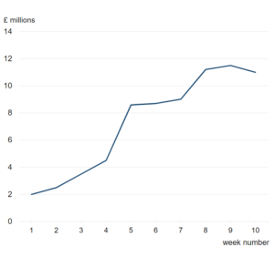
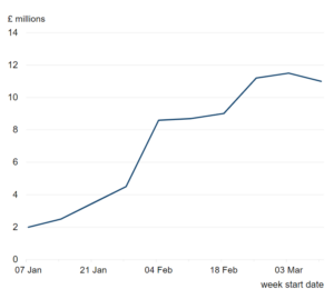
When plotting weekly data, it is recommended that dates are shown on the x-axis rather than week numbers. Showing dates provides a more intuitive understanding of trends over time. Week numbers can be ambiguous and may not align with calendar months or years. By using dates (for example, week starting or week ending) on the x-axis, you ensure clarity and accuracy in your visualisations. Additionally, if space is an issue, consider customising the date axis labels. For example, show every other label or use truncated months (e.g., Oct, Nov).
Example:
The example shows two line charts displaying the same data, one (above) showing week number on the x-axis and the other (below) showing the date the week ended. Dates provide a more intuitive interpretation of trends through time.
Summary
To be accessible, a chart needs to have:
- accessible colours and fonts – you can find out more about accessible colours and fonts in our ‘Data visualisation: colours’ guidance
- a title in the body text – remember any headings should follow the correct heading tagging structure
- alternative text describing the message of the chart – this can be a plain text description in the body text, or a table of data
It is best practice to also have:
- an accessible data file with just the data shown in the chart
- the name of and link to the specific data source in the body text directly underneath the chart
- an HTML chart or an image of the chart in the SVG format
Making tables accessible
As analysts we publish three broad types of table:
- demonstration tables that present important data within a report
- reference tables which are provided alongside a report for users who need detailed data
- machine readable datasets which are tables formatted to be read by machines
Creating demonstration tables
You can find more detailed advice on best practice for the layout of tables in our ‘Data visualisation: tables’ guidance.
Publishing demonstration tables
Note: Images of tables should not be used, as images of text are only allowed in specific circumstances (success criterion 1.4.5 images of text, level AA).
If the website you publish on can create tables in HTML you should publish your tables in HTML format. For example, tables can be created in HTML on GOV.UK.
You can also convert a table created in Word or Excel to a table in ‘Markdown‘ (the language needed to publish in HTML). You can use an online markdown conversion tool to do this, but be careful about using it with unpublished data.
You can find guidance on the markdown to use when creating HTML tables on GOV.UK.
You can also find guidance on when to use HTML demonstration tables and how to ensure they are accessible on GOV.UK.
Improving your understanding of how screen readers deal with HTML tables and watching this video of a screen reader accessing a table may help you understand how tables are marked up in HTML.
If you have to create a table within a document format you will still need to make sure it is accessible. See the section on making document formats accessible.
If reference tables are published in spreadsheet documents, they need to be made accessible.
Our guidance on Releasing statistics in spreadsheets has in-depth advice on how to publish accessible spreadsheet documents.
If your current spreadsheet document does not meet the accessibility guidelines but you feel that it does assist your users, you can publish two versions of the same document. One that meets the accessibility guidelines and one that does not.
Making other types of visual content accessible
If there are other types of visual content you need to make accessible but are not sure how, please let us know by emailing Analysis.Function@ons.gov.uk.
See our guidance on infographics and our tips for dashboards for general advice.
Look at GDS guidance on other types of visual content such as diagrams and infographics.
Document formats
Document formats should be the last resort for reports
PDF and other document formats are a last resort for any new text based publications like statistical reports. Wherever possible publications like this should be made available in HTML.
Reasons for this include:
- document formats will never be as accessible as HTML content
- search engines cannot look inside document formats – making content harder to find
- document formats are harder to keep up to date than webpages because the editing process takes longer and sometimes the source copy of a PDF gets lost
- it can be difficult for users to tell if a PDF is out of date as search engines often take users directly to a PDF – when this happens it is not easy to find out if it is the latest version
You can find out more about why website content should be published in HTML and not PDF on the GDS blog.
Be aware that GDS no longer allow PDFs to be published on GOV.UK unless an accessible HTML or open document version is published alongside it.
Open formats
If you do publish documents you should publish them in an open format.
This is not explicitly mentioned in the accessibility regulations, but open formats make outputs more accessible because they do not rely on users having access to specific software.
Files published in Microsoft Word or Excel format are not open because they rely on users having access to specific software.
Comma-Separated Values (CSV)
If your users want machine readable datasets you should provide them in a CSV format (or, ideally, through an Application Programming Interface (API)).
Files meant solely for machine consumption are out of scope of the accessibility regulations. This means they do not have to meet the accessibility regulations because they are not meant for users to read themselves.
If you publish a CSV file and intend for users to open, read and analyse the content themselves you need to make sure it meets the accessibility regulations. This can be more complicated than you might think. CSV files only allow one tab per spreadsheet and strip out almost all formatting. They do not provide the assistance certain types of formatting can provide, such as a clearly tagged header row and the ability to mark-up a table so a screen reader can understand it.
Open Document Spreadsheet (ODS)
These are very similar to Excel spreadsheets. ODS files allow more than one tab and formatting tools can be used to make the content accessible.
However, we understand it may not be straightforward to open ODS formats on older iPhones. In comparison, it is straightforward to open Excel spreadsheets.
Ideally you should supply data in multiple formats. But if this is not possible, finding out what format your users need the most is the best approach.
Open Document Text (ODT)
If your Word document just contains text, we recommend using the ODT format. These text files will open on Word if you have that software but you do not need it to be able to open them.
If your Word document contains text and tables, some crucial table mark-up will get lost if you save it in the ODT format. In this situation it is best to save it in the Word document format.
PDFs are a common way to present a text-based document online. They open in an internet browser and can be made to meet the accessibility guidelines.
However, making PDFs accessible can be quite complex and they are not the best option for accessibility. As mentioned, GDS no longer allow PDFs to be published on GOV.UK unless an accessible HTML or open document version is published alongside it.
For text only documents (or text with some images), the ODT format is more accessible than PDF because ODT files can be opened in software that allows the user to make changes to suit them. For example, users can change the size of the text and the colours used in images or charts.
However, there may be some issues with the ODT format in some circumstances. It is best to check with your publishing colleagues or speak to your users for more information.
Making document formats accessible
Sometimes publishing documents is unavoidable. In this section we have guidance on how to make document formats accessible. The steps you will need to take will depend on the format of your source document.
Ideally you will have the source document for your PDF. This will often be a Microsoft Word document. If you have this, you should take steps to make the source document accessible before saving it as a new PDF document.
If you do not have access to the source document you will need access to Adobe Acrobat software that allows you to make edits to the PDF document itself.
You will need to make sure the written and visual content is accessible by following the guidance in previous sections.
You will also need to ensure all content is tagged correctly so the structure can be understood.
Depending on your version of Adobe Acrobat you may also have access to the built-in accessibility checker. This can be used to check accessibility and will direct you to online tutorials about how to make edits to fix any accessibility issues it finds. However, the accessibility checker will not necessarily find all accessibility issues, think of it like a spelling and grammar check.
Making PDFs accessible is not always easy and if you publish on GOV.UK you should also be aware that GDS no longer allow PDFs to be published unless an accessible HTML or open document version is published alongside it.
Simplify
Strip out any content that is not necessary. Think about your document as if it is webpage on the website you are publishing on. Do not use lots of colourful diagrams and logos unless they are strictly necessary.
Structure
Properly structuring your content is important in order to meet success criterion 1.3.1 info and relationships (level A).
If using Word:
- use Word’s ‘styles’ tool to create a hierarchy of headings – the title of the document should be ‘heading 1’, first level subheadings should be ‘heading 2’ and so on (Worcestershire County Council have a good video that shows you how to tag headings in Word)
- use the bullet point tool in Word to create lists
Structuring content in Excel is a bit more complicated. See our ‘Releasing statistics in spreadsheets’ guidance.
Written content
The written content should follow the advice outlined in the ‘Making written content accessible’ section of this guidance.
Formatting
Tips for formatting:
- All text should be in a sans serif font (such as Arial or Calibri).
- All text should have the ‘automatic’ colour selected (except for hyperlinks which take on the default blue colour).
- this will mean editing the colour of headings after you tag them
- using the ‘automatic’ colour is important as some users will need specific settings for colour contrast – when you select a specific colour, these settings do not get activated
- Avoid justifying text
- Ensure line spacing is at least space-and-a-half within paragraphs, and paragraph spacing is at least 1.5 times larger than the line spacing.
Images
It is best to avoid images in Excel documents. This is not mentioned specifically in the accessibility regulations but because Excel documents are more difficult to navigate in general, images can complicate this further.
Images in Word documents should have appropriate alt text in the properties of the image, unless they are only decorative, in which case they should have two double quotation marks (“”) in this field. Read more about alternative text in the ‘Making charts accessible’ section.
Tables
When making tables in Word you should use the insert table tool.
To ensure you meet the success criteria relating to tables, make sure:
- the table has a defined header row (highlight the header row – click the blue ‘Design’ tab and then click the ‘Header row’ checkbox)
- the checkbox that says ‘Repeat as header row’ is checked in table properties if your table runs across multiple pages – this means the header row is repeated at the start of the table on each page the table runs onto, so users do not have to keep referring back up to the top of the table
- the checkbox that says ‘Allow row to break across pages’ is not checked – this keeps the table rows all on one page
- to check the reading order of the table is sensible by tabbing through the table content
You can also add alternative text in the table properties, but this is not strictly necessary for tables.
When making tables in Excel documents see our guidance on Releasing statistics in spreadsheets.
Set the language
Go to ‘File’ and then ‘Options’ and then ‘Language’. Make sure the document has the correct language(s) selected (success criterion 3.1.1 language of page (level A)).
File name
File names should:
- be unique – for example, do not call all your data downloads ‘Data download’
- be descriptive and make sense out of context – for example, tell the user what is in a data download, do not just call it ‘Data download 1’
- be frontloaded
- be short – aim for 60 characters including spaces
- not include acronyms – put these in the document information as keywords or tags
- be entirely in lowercase
- use dashes instead of spaces or underscores between words – this makes file names easier to read, for example: ‘a file name.ods’ will end up as: ‘a%20file%20name.ods’ online, which is why it is better to call it ‘a-file-name.ods’
- not include a date, unless the date is part of the document title – for example, ‘Business plan for 2016 to 2017’
- be sensible – do not include a version number, names or words like ‘draft’, ‘clean’ or ‘final’, unless those words are part of the document title (for example: ‘guidance-on-how-to-make-documents-accessible’ is a more sensible file name than ‘access-guid-final-draft-Han-edit3’)
There is not a specific success criterion in the accessibility guidelines for file names but it comes under ensuring content is understandable by making it readable and predictable (guidelines 3.1 and 3.2).
Provide information about the document
Go to ‘File’, then ‘Info’ and fill in the following fields:
Title – this should replicate the title on the front cover – do not use dashes or underscores here.
Author – generally this should be the organisation that published the document.
Keywords or Tags – put in a list of terms that someone might use to search for the document, separated by commas. This helps search engines find the document. They also help with finding your document internally.
The information in the title field is required by the accessibility regulations (success criterion 2.4.2 page titled (level A)). It is best practice to also fill in the author and keyword fields.
Checker tool
Newer versions of Microsoft Word and Excel have a built-in accessibility checker. If you have this, run an accessibility check and correct any issues. It can be found under the ‘Review’ ribbon.
Note: although the accessibility checker is a useful tool, it may not pick up all issues such as links without specific descriptions. Treat it like a spelling and grammar check.
Saving or exporting
When it comes to text documents remember that ODT files are better than PDFs in terms of accessibility because they can be opened in software that allows the user to adjust the content to their needs.
If you have to save a document in a PDF format please follow the following steps:
- Go to ‘Save as’
- Choose PDF in the ‘Save As’ dialog box
- The dialog box will adapt slightly – you should see an ‘Options’ button – click it and make sure the following checkboxes are selected:
- Create bookmarks using headings
- Document properties
- Document structure tags for accessibility
- Click ‘Save’
If you work with a publishing team you might want to check with them about whether they want you to save or ‘export’ your document to PDF. The important thing is to ensure the checkboxes outlined above are ticked.
If you have a PDF of previously published material and you would like to check if it is accessible you can use an online accessibility checker. But, remember, just like the accessibility checkers built into the newer versions of Word, Excel and Adobe Acrobat, these checkers will not pick up on everything. Treat them like a spelling and grammar check.
It is best practice to always link to accessible content when you can.
If you have control over the content you are linking to you have an obligation to make it accessible under the regulations.
If you do not have control over the content you want to link to, you can link to content that does not meet the accessibility regulations if necessary.
GDS have also published guidance on publishing accessible documents that you may find useful.
They have also shared a video about publishing accessible documents.
Making social media content accessible
Creating accessible content for social media will help you reach more people.
Furthermore, publishing inaccessible content on social media platforms could be breaching legislation such as the Public Sector Equality Duty (part of the Equality Act 2010).
Guidance to help you ensure your social media content is accessible:
- Planning, creating and publishing accessible social media campaigns – guidance from the Government Communication Service.
- Making your social media accessible – guidance from the Royal National Institute of Blind People (RNIB).
This blog post on sharing results of the online word game ‘Wordle’ is a really good example of why inaccessible content is annoying on social media. It also shows how people find inventive ways to fix issues.
Tools to check accessibility
- WAVE accessibility tool – this is a Google chrome extension.
- High contrast – Google chrome extension to help you check your site using different types of contrast options to make sure content is still readable/visible.
- NVDA – free screen reader software which can be used to test the accessibility of websites and documents.
For automated testing you can use a range of tools, including:
See the GDS accessibility team’s audit of the most used accessibility tools if you’re not sure which tools to use.
You can also perform manual checks:
Related links
- GDS version of WCAG A and AA guidelines
- GDS guidance on understanding WCAG 2.2
- GDS guidance on understanding accessibility requirements for public sector bodies
- GDS guidance on making things accessible and inclusive
- GDS guidance on content design: planning, writing and managing content
- GDS guidance on publishing accessible documents
- GDS guidance on making your service accessible
- GDS guidance on testing for accessibility
- GDS guidance on how to make tables accessible on GOV.UK
- GDS guidance on making visual content accessible on GOV.UK
- GDS guidance on using Markdown to format content on GOV.UK
- GDS library of HTML elements designed to be accessible
- Video about creating accessible online documents
- Accessibility user personas
- Our ‘Releasing statistics in spreadsheets’ guidance
- Resources to use with our releasing statistics in spreadsheets guidance
- Our checklist for making spreadsheets accessible
- Accessibility empathy for spreadsheets (an exercise to try)
- Microsoft guidance on making Excel spreadsheets accessible
- Guidance on making spreadsheets accessible from Michigan State University
- Royal National Institute of Blind People (RNIB) guidance on creating accessible Excel spreadsheets (DOCX, 192KB)
- aftables R package
- gptables in Python or R
- Guidance on writing good hyperlinks
- PDF accessibility checker
- GDS style guide
- Accessibility in PowerBI
- Our guidance on using symbols and shorthand in tables
- Quick accessibility checks anyone can do
- WCAG, but in language I can understand
- “A case study in alt text” blog
- Accessible numbers – presenting numbers and data clearly
Any questions?
GDS has set up an accessibility community.
You might be interested in this community if your work involves:
- writing content or code
- designing the user experience
- doing user research
- managing a product or service
You can also join if you want to learn more about accessibility, or if you do not want to tackle accessibility issues on your own.
You do not have to be in an accessibility-related role to join, but you must be working in or with government. Most people in the group are not accessibility specialists.
If you have any further questions you can:
- email Analysis.Function@ons.gov.uk
- join our Basecamp project for accessibility for statistics and analysis or presentation and dissemination of statistics and analysis – if you are not on the Cross Government Basecamp, email Analysis.Function@ons.gov.uk for an invite link
- contact your departmental presentation or web dissemination champion
- contact us through Twitter @gov_analysis