What I have learnt since joining the Analysis Function Communicating Analysis team

This blog is part of our Analysis in Government Month 2023 series. You can find more articles and resources on our Analysis in Government Month hub.
I joined the Analysis Function Communicating Analysis team six months ago. We have recently launched our new data visualisation e-learning and it has made me think about what I have learnt in the last six months.
Here are just five of the many things I have learnt since joining the team.
People are time poor
It feels like there are never enough hours in the day, and it seems I’m not the only one who feels this way. Although we would love our users to read every report we publish from beginning to end, I have learnt this is not the case.
In the real world, users dip in and out of documents. They search around to find specific information and rarely read full documents.
I too am a culprit of this. I regularly use the “Find” function to jump to different sections in documents. I keep this in mind when I’m writing formal content.
Do not rely on colour
Like all stereotypical geographers I love using colour! My revision notes at school were always colour coded. Yet, since joining the Analysis Function Central Team, I have learnt colour can cause issues if it is not used correctly.
If we incorrectly use colour we can risk excluding users, such as people with visual impairments and colour blindness. For example, if we use colours which are similar, they may appear as the same colour. Or if we use colours which are too light some people may not be able to see them.

We need to be conscious of colour brightness and how colours contrast with other colours around them. So, I introduce you to another great tool: the WebAIMS colour contrast checker. I have written instructions for using the colour contrast tool in our colours guidance if you need more support with this. This handy tool compares two colours and tells you if they meet the accessibility criteria when used together.
If you are new to checking which colours are accessible or the idea of colour contrast, module 3 of the data visualisation e-learning is a great place to learn more.
Just because you know lots of big words does not mean you should use them
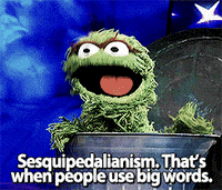
While in education I often envied classmates who had brilliant vocabularies. They would casually drop big words in to essays and class discussions. I now realise these words were often unnecessary.
As I mentioned before, most people are time poor. If we can make content simpler so it is quicker to absorb, why not do it?
Sometimes certain technical topics need specific terminology to create clear explanations. But there is a difference between using big words for specific terminology and using big words for the sake of it.
Our team uses the Hemingway App, which is a great tool to help make your writing clearer and avoid unnecessary vocabulary and jargon. The program can help keep the readability level suitable for our readers. It suggests alternative words that can help simplify your text and highlights unneeded words which can be removed altogether.
Always consider where and how to place emphasis
Before I started working on this team, I would use lots of different text effects to emphasise information in my content.
Two types of formatted text. One overuses formatting under the heading “How it started”. This has uppercase red text in bold and italics with a green highlight. The other has clearer formatting under the heading “How it’s going”. This uses black text in sentence case with only one word in bold for emphasis.

I now understand some of the difficulties people face and the little things we can do to create clearer content.
For example, italic and underlined text can cause issues for people with dyslexia and low vision. Adding these types of formatting can change the appearance of letters. This can make the letters hard to distinguish. We should instead draw attention to specific words or phrases using minimal amounts of bold text only when it is necessary.
Accessibility is for everyone
There is sometimes a misconception that by making content more accessible, it somehow excludes certain people. From my experience, this is not the case. By making your content accessible, it often actually makes it better for everyone.
Accessible content is defined as “content that can be used and understood by as many people as possible”. If we create content which is accessible, we are improving it for everyone.
We suggest you remove unnecessary formatting when you are trying to make content accessible for people with dyslexia. This makes the content clearer. Clearer writing is easier and quicker to read, which is a positive for everyone in a society where we are time poor.
By adding alternative text to a chart we can communicate the message it displays to users who use screen reader software. But charts can have a lot of possible messages. Alternative text can help everyone quickly understand the message the writer is trying to highlight, even users who are not using assistive software.
Making content accessible helps everyone, so it seems obvious to me it should not be an afterthought. When we are creating content we should think about accessibility from the start and encourage other people to do the same. If we do this, it will soon become a natural part of how we work.
Ella Goodman
Find out more about the support the team offer with communicating statistics and analysis.