Increasing the impact of your communication

The most innovative and exciting analysis won’t influence anything if it’s not communicated clearly. Long sentences, confusing structure, and unclear conclusions never helped anyone. We’ve all spent hours cleaning data, calculating trends, and creating insightful charts, only for it to not cut through the noise.
To help you increase your communication impact, the Government Statistical Service (GSS) Presentation Champions have published new guidance outlining some top tips for writing about data. We are a cross-government network that meets regularly to discuss best practice and share ideas. Chances are that someone from your organisation already attends (see who on our webpage).
We found that a lot of the previous guidance was too long and detail-heavy. To solve this, we spent a couple of months reviewing what was already available, condensing the most important information, and adding some clear examples.
Although the guidance was written by the GSS, it is relevant to all professions. Whatever you are writing, these are some of the guiding principles you should follow to increase your impact.
Tailor your writing to the audience
You should understand who your audience is and what they are interested in, so that your content and tone can fully meet their needs.
Always use plain language
You should explain any technical terms, write out any abbreviations, and consider removing any unnecessary words where you can. The Government Digital Service (GDS) has some useful resources on this topic.
Focus on the important points
Be specific about the point you are making and assume the audience is short of time. Limit each paragraph to one idea – your audience should be able to read the first sentence and understand the main points of your analysis. Hemingway Editor can show you which parts of your writing are too complex (do not input sensitive information or data).
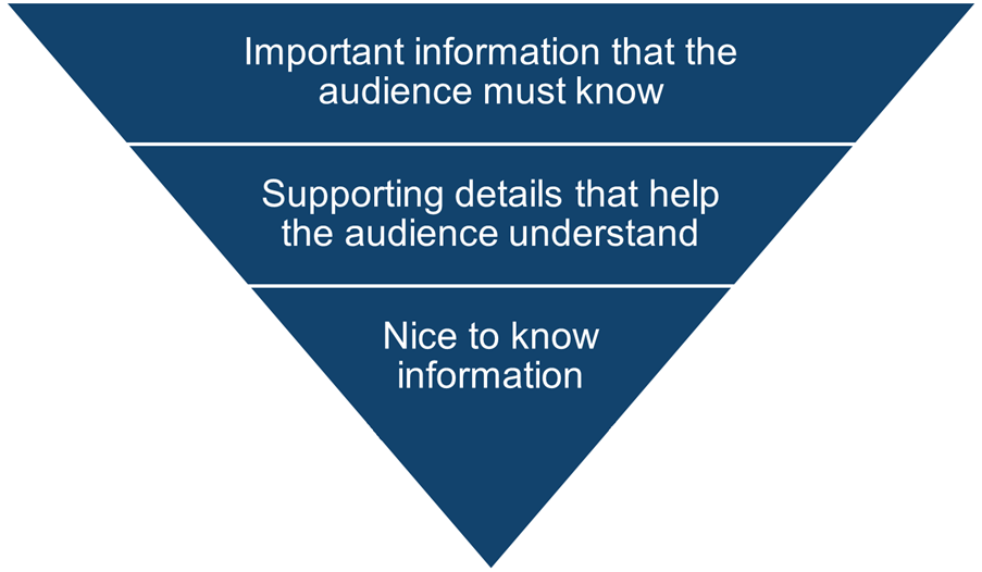
Have a logical and organised structure
Use the inverted pyramid (see Figure 1). Important information that the audience must know should come first, followed by supporting details that help the audience understand, and lastly any nice to know information.
Put your data into context
For example, is a 2% rise unusual compared to previous years, other countries, or the policy target? Outline the overall trend, highlight specific areas of interest, and explain what the implications are. Calculating summary statistics is only the start, the real value is in showing what this trend means in practice.
Be transparent about the strengths and limitations
Help the audience use your analysis confidently. Explain any uncertainties, why they exist, and what their effect on the data is. The Uncertainty Toolkit for Analysts in Government has more information on this.
What’s next
It’s great to have seen the positive feedback the guidance has received. It’s performed well on the Analysis Function website, and our short and snappy approach has paid off.
Keep these principles in mind when writing about data and your next piece of analysis will be even more impactful.
If you have any suggestions for the guidance or would like to get involved in the GSS Presentation Champions Network, please email PresentationChampions@dft.gov.uk
Robert Clapp, GSS Presentation Champion, Department for Energy Security and Net Zero