
afcharts for Python: accessible charts made easier

The Analysis Function data visualisation guidance helps analysts create charts that are clear, impactful and accessible to all users. But applying it by hand (choosing the right fonts, colours, gridlines and layout for every chart) takes time and leaves room for mistakes. The afcharts R package has long solved this for R users. Now afcharts is available for Python too.
afcharts automatically applies the recommended styles to your charts and provides easy access to accessible colour palettes. Write your chart as normal in Matplotlib or Plotly and afcharts will handle the rest.
Getting started
You can install afcharts from PyPI with a single command:
pip install afcharts
Then apply the afcharts style to all your charts. For Matplotlib:
import matplotlib.pyplot as plt
plt.style.use(‘afcharts.afcharts’)
For Plotly, use the following commands:
from afcharts.pio_template import pio
pio.templates.default = “afcharts”
Every chart you create after running these lines will automatically have the recommended fonts, axes, gridlines, and layout.
Accessible colour palettes
The get_af_colours() function returns colours from the Analysis Function colour palettes. There are four palettes to choose from:
- categorical (up to 6 groups)
- duo (comparisons)
- sequential (ordered data)
- focus (highlight a single series)
Each palette is designed to be accessible and easy to distinguish. Use the following commands to use this function:
from afcharts.af_colours import get_af_colours
colours = get_af_colours(“categorical”)
Example charts
With afcharts, the core formatting for both of the charts in the following examples came for free. afcharts handled fonts, axes, gridlines and layout automatically.
Figure 1: Life expectancy in the UK and China, 1952 to 2007
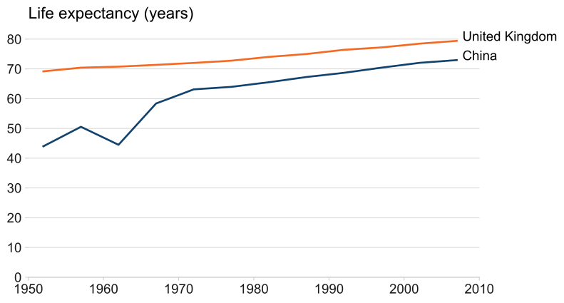
The line chart shows life expectancy in China and the UK from 1952 to 2007, styled with afcharts. Two lines rise from 1952 to 2007, with China showing a steeper increase.
Full code
See the full code for Figure 1 in Matplotlib.
See the full code for Figure 1 in Plotly.
Figure 2: Population by continent, 1952 to 2007
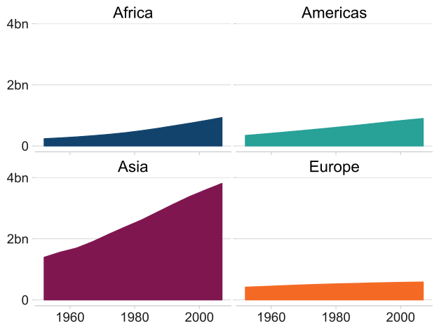
The small multiples area chart shows population growth by continent from 1952 to 2007 in Africa, Asia, Europe and the Americas, styled with afcharts. Each panel displays one continent with a shaded area beneath the line.
Full code
See the full code for Figure 2 in Matplotlib.
See the full code for Figure 2 in Plotly.
The afcharts cookbook
The afcharts cookbook contains full, reusable code examples for common chart types — including bar charts, scatter plots and maps — in both Matplotlib and Plotly.
The cookbook goes beyond what afcharts applies automatically, covering techniques such as text wrapping to improve readability and chart annotations to supplement or replace legends that rely on colour alone. Each example is designed to be copied and adapted for your own charts, saving you time and helping you consistently meet the Analysis Function guidance.
Give feedback
We welcome your feedback. If you find a bug or want to suggest a feature, raise an issue on our GitHub. For general questions, start a thread on GitHub Discussions.
Thank you to the Data Visualisation Python Tools group in the GSS Presentation Champions Network for building this package. The afcharts Python package builds on the afcharts R package and the py-af-colours package.
Nick Henden