Advice for policy professionals using statistics and analysis
Note: this content is due to be reviewed and updated soon. It does not incorporate the accessibility legislation
Policy details
| Metadata item | Details |
|---|---|
| Publication date: | 3 February 2022 |
| Owner: | Analysis Function Central Team |
| Who this is for: | Policy professionals |
| Type: | Guidance |
| Contact: | Analysis.Function@ons.gov.uk |
This guidance aims to help policy professionals work effectively with statisticians and other analysts. It introduces some important statistical ideas and concepts to help policy professionals ask the right questions when working with statistical evidence.
The guidance is designed to stand alone. It brings together the main points from the seminar “Ten things you really need to know about statistics”. The seminar is led by the Analysis Function. It is designed to help policy colleagues:
- understand statistical information
- understand how important it is to present statistics accurately
- check whether statistics make sense in the context of their policy area
- use statistical information
- challenge statistical information
The seminar does not introduce the theory and methods of statistics. Neither does this guidance. We have done this on purpose. These ideas are better covered elsewhere.
Why statistics are important for policy professionals
You can usually improve the case for a policy by including statistical evidence. You can use statistics to:
- show context
- help demonstrate the predicted effect of a policy
- show the predicted cost of a policy
The statistics might come from published information. Or you might ask your analyst colleagues for new evidence. As a responsible user of analysis, you should understand what you are told about strengths and limitations of the information. You can then make sensible decisions about your next actions.
We recommend that you build a close and ongoing relationship with your colleagues in the Analysis Function. Make connections early. Maintain them throughout the policy development cycle.
1. Take a critical look at the numbers
When you a have a set of statistics, take a critical look at them before you include them in your evidence base. Do they look right? We are not casting doubt on the ability of analysts, although mistakes do sometimes happen. Are you sure that you have a clear understanding of the question that the numbers address?
To show this in action, we chose a front-page article from the Daily Telegraph in 2015 (paywall). The headline read “Cannabis causing a quarter of psychosis”. The article said that 60,000 people in Britain are living with serious mental illness because of the drug.
As a general reader we might take a passing interest in a story like this. But imagine that you are the public servant responsible for a policy intervention to stop this happening or to help deal with the consequences. That is when it can be helpful to question the numbers that you see.
The Telegraph article used findings from a research article in the Lancet Journal of Psychiatry. The authors found that 24% of psychosis cases in their study group were linked to the use of high strength cannabis, once other factors were accounted for.
The Telegraph article said that a quarter of psychosis cases were caused by skunk cannabis. A quarter is 25%. We think this comes from the 24% reported in the Lancet. 24% is a bit smaller than 25%. But it is reasonable for the newspaper to simplify the number in this context.
The results in the Lancet were from a sample of 410 adults aged 18-65 in South London. The level of psychosis and the use of cannabis are both high in South London compared to the rest of the country.
Interestingly, the research paper did not mention the “60,000 people in Britain” from the Telegraph article.
If you were planning a change of policy based on these figures, it would be sensible to check the original source of the information. Find out if the numbers are based on any important assumptions. Think about whether they are reasonable.
We recommend that start by trying out some simple sums to check the logic behind the numbers.
We cannot be sure how the Telegraph got to 60,000, because the article does not explain this. But we can use easily available information to see whether 60,000 looks broadly sensible.
To start with, we know that there were about 64.1 million people in the UK in the middle of 2013. We can get this figure from government population estimates.
We also know that 0.4% of adults suffer from psychosis. This figure comes from the 2007 Adult Psychiatric Morbidity Survey. This is another government statistical source.
Bringing those figures together, we could estimate that about 0.4% of 64.1 million people have psychosis. This works out as 256,000 people. From the Lancet article, we think that about 24 percent of psychosis cases are linked to use of high strength cannabis. Taking 24% of 256,000 we get the answer of 62,000 people.
Using the 24% statistic in this way helps to make it clear that the 24% refers to the psychosis cases. We are not saying that 24% of cannabis smokers will go on to suffer from psychosis.
Our assumptions
By doing some simple sums based on readily available information, we have roughly the same figure as the Telegraph. But by making this calculation we have also made some very important assumptions. Do they make sense?
Assumption 1
We have applied the 0.4% number from the Adult Psychiatric Morbidity Survey to everybody in the UK, not just the adults. By doing that, we assume that the psychosis rate is identical for adults and children. We do not have any evidence to support this assumption.
It would have been better to exclude children from the population total when multiplying by 0.4%. But if we did that we would get an answer of less than 62,000.
Assumption 2
We have applied the 24% from the Lancet study in South London to all psychosis sufferers. We know there were some local issues in this area but have assumed that the 24% we found there applies everywhere. We do not have any evidence to support this assumption.
Assumption 3
The data are from different times. The Psychiatric Morbidity survey is from 2007. The population data are from 2015. By bringing them together we have assumed that there are no problems with this. The time difference is less worrying than the other two assumptions because we expect these indicators to change slowly. We must still note the assumption.
The effects of our assumptions
When these assumptions are taken together, they include a lot of people who we should probably leave out of the total. As a result, we may be overstating things by quite a margin.
If this were a real policy scenario, this would be a good time to contact your analyst. You should talk through the concepts and the assumptions you have made. You can then work to understand what can reasonably be said about this evidence. You can also work out if the findings are robust enough to warrant a major policy change.
You can find more discussion of this example on the Full Fact website.
2. Understand what you are measuring
Government policies are designed to have a positive effect on groups of people or things. Policies usually have an intended or predicted effect that will need to be evaluated.
For a fair evaluation, we must clearly define the group we want to measure at the very start. In statistics we often call this the ‘target population’. By clearly defining the target population we can provide accurate statistics. It helps us to avoid confusion. It also helps us to avoid bias in our reporting.
It is not always easy to narrow down what is in scope. Some examples of groups or things we might need to define in different policy contexts include:
- troubled families
- people eligible for a COVID-19 booster vaccine
- historic buildings and monuments
- cyber security breaches
- migration
We also need to be able to identify and measure the target population in a practical way. For example:
- Can we identify the group from information available in administrative systems?
- Do we need to ask people whether they fit the criteria?
- If do we need to ask people, what questions should we ask and will they be able to answer them accurately?
When we are sure that we can identify the things we need to count, we need to think about what we are going to measure about them. The information we need may be registered in an administrative system. But if it is not we may have to ask questions to get the information.
Sometimes, what we want to measure is not available. It might not be easy to form questions to get the information we need. Perhaps we do not have the resources to collect what we need. In cases like this, we may need to use a ‘proxy measure’ instead. A proxy measure is information that we can collect which is similar enough to what we need to be a good indicator for it. For example, the number of unemployment benefit claimants might be a good proxy measure for the number of unemployed people.
We can now define and count our target group and collect the right measures about them. Next, we need to think about the statistics we will calculate from the data.
These might be summary measures like an average. They could be more complex statistics that show the relationship between different quantities.
Finally we need to think about what success looks like. We need to consider:
- what change in the numbers will we consider a success?
- will the data be accurate enough to clearly indicate whether that level has been met?
3. Where the data come from
We need data to understand how policies are working. We also need it to help with policy-making.
Data can be collected for statistical purposes in a census or a survey. It can also be collected as a by-product of an administrative process. New sources of data might also be available. This could include things like mobile telephone traces, online transactions or social media posts.
In practice, data sources always have limitations. These limitations may affect the quality of the statistics. We will need to understand the limitations when we use the statistics to make decisions. By understanding data collection processes we can see the strengths and limitations of the data. We can also understand the quality of statistics based on the data.
It is important to know how often the data is collected. Data might be available annually, monthly, weekly or daily. For digital sources like social media posts or search engine traffic it might be available every few seconds.
While timely data provide a current picture, very frequent measures tend to vary a lot. Working out the difference between random noise and real change can be difficult. We often need to smooth or summarise data like this to see patterns and trends.
Censuses
Censuses are very big surveys. They are designed to get information from everybody in the population. In a census, we ask every household in the country to give us data. We also collect information from institutions like the military, hospitals and prisons so that everybody is included.
Censuses are the most comprehensive data collections we can do. In a census we have full control of:
- the questions that we ask people
- how we carry out the data collection
- how we process and present the data
This means that the information we collect is very high quality. We can be sure that we will measure exactly what we need to. Also, we can measure the quality of the results very accurately because we control the design and the process.
The main issue with a census is the cost of the data collection. In the UK, we run the population census every ten years because it would be too expensive to collect the information more regularly.
Surveys
Surveys have similar advantages to censuses. But in a survey, we collect information from a sample of people. We do not ask everybody for information. This means that statistics from surveys are less accurate than statistics from a census. If we design the survey well we can work out the size of the uncertainty.
When data are collected purposefully in a well-designed census or survey, we can answer policy questions directly from the questions asked. The people who are responsible for collecting the data should be able to clearly explain how they made sure that different groups are represented fairly. They should also be able to explain how they know that the data about each subject is as close to the truth as possible. The cost of collecting the data should also be considered.
Survey analysts will aim to design a large enough sample to produce reliable estimates. But it is important to understand the level of uncertainty around the numbers. You should also look at the interests of those commissioning the survey. Could the study be designed to reach a particular conclusion on purpose?
Administrative data
Administrative data are attractive because they are by-products of existing processes. As a result, they cost much less than censuses or surveys. Even so, you should think about whether they are likely to fairly represent the population you are interested in. The information collected in administrative data may not exactly match the measure you need. The process of collecting and maintaining the data may introduce biases or errors. This will carry through into your analysis unless you adjust for them.
Let’s look at an example. ONS researchers compared the NHS Patient Register in April 2011 with the 2011 Census. Both sets of data were gathered at the same time. They were interested in whether the NHS register could be used to count the population. They found that that the Patient Register under counted the population in some rural areas, and over counted it in large cities. How can we explain these differences?
It turns out that the differences are driven by how the NHS register is administered and who is on it. For example:
- the register under counts newborn babies because it takes time to register them
- the register includes some people who have died or left the country until data maintenance removes them
- young adults and recent migrants are often registered in the wrong place because they move around a lot – this means they are over counted in large cities
- older people and families are well represented, because they interact with the National Health Service a lot
- military personnel are not always registered because they have their own health services – this explains the under count in rural areas with large military bases
None of this is surprising when you understand how the register works. But these issues have serious effects when we use the register to count people for statistical purposes.
By thinking about the process that was used to create statistics you can learn more about their quality. Ask yourself:
- is there a clear account of the way the data are collected, by whom, and the rules they used?
- is there a process to audit or quality assure the data?
- how confident are you that the audit and assurance is reliable?
You should also think about the motivations of the people who recorded the data. Is there a chance they could be recording or scoring cases to improve the way their own performance looks? This is uncommon, but it does happen.
Other data sources
Because of the internet and new technology there are lots of new ways to collect data. For example:
- your health tracking device records when you do exercise and measures your heart rate
- you post messages on social media
- you search the internet for information
- your mobile phone tracks your location
All of these activities make data. Remember that new data sources have issues of bias and coverage just like surveys and administrative data. Think about what they measure, how they measure it and how it is relevant to your policy question. Ask yourself:
- who might be more or less likely to appear in the data?
- how could collection or processing affect the results you see?
- are there ethical or legal reasons why using the data is not appropriate?
Let’s take an example. You are interested in using mobile phone data to understand commuting patterns. You need to understand if the data covers everybody. You should think about whether:
- the data include pay-as-you-go customers or just contract customers
- customers choose not to share their details
- the proportion of people who are customers changes in different parts of the country
- you have enough data from different companies to give you accurate numbers
All these things would affect the quality and reliability of data that might seem very comprehensive. Talk to your analyst colleagues about issues that affect the data you plan to use.
4. How the statistics are calculated
Statistical processes create the numbers you use from raw data. The processes are usually closely linked with how the data are collected. They rely on knowledge about likely strengths and limitations.
We have dealt with the subject of data collection separately to the later stages of data processing in this guidance. As policy professionals, you usually have direct access to the people who are producing the statistics. You can rely on them for reassurance about data collection.
You will need to make a judgement about whether the people who have produced the statistics are reliable. You could do this through a formal commissioning process which looks at their professional standing and reputation. You should think about whether the processing and reporting of statistics could be biased. Think about whether the producer could have any reason to make their performance seem better than it is.
You may have more confidence if the producer works to professional standards of independence and honesty. An example is the Code of Practice for Statistics. Codes like this usually include rules to make sure data is collected ethically. They also include rules to keep data confidential.
You should expect to see supporting information about the quality of statistics and the methods used to produce them. This should include:
- statements about the quality of the data
- explanations about how the producers deal with problems in the data when calculating the statistics
- assumptions made to justify the methods the producer has used
Be critical and concentrate on how you will use the statistics. Your analyst colleagues should be able to explain any limitations or important issues that will affect what you want to do. Make sure you use their knowledge.
You might see statements about how the definitions used in the statistics line up with similar ones used in other statistics. This helps to improve comparability. It should help you understand the strengths and limitations of the statistics. You can then decide whether you can use them effectively.
Data collection and statistical production processes change. A new contract may be awarded. A better method might be discovered. The administration of a policy can change. The risk here is that there is a change in the output that is because of the redesigned process and not a real difference in the thing you are measuring.
Expect to see assurances about the continuity of statistical processes and data collection. You might see a statement about how the producers are working to reduce the effect of changes to the process. You should also expect to see information about how changes might affect the outputs.
5. Making fair comparisons
The same thing measured in different ways
We sometimes have several statistics about the same topic. This can be helpful when you are working to understand a policy issue. But there are times when similar numbers seem to give conflicting or very different information.
Think about this example.
The Department of Culture, Media and Sport (DCMS) Creative Industries Economic Estimates estimated the value of the advertising and marketing sector of the British economy in 2013. They said that the approximate Gross Value Added, or aGVA, was £10.2 billion. They also said that the sector employed 167,000 people.
A 2013 report from the Advertising Association (AA) and Deloitte Consulting told a rather different story. Their analysis reported that £16 billion was spent on advertising, leading to a £100 billion contribution to Gross Domestic Product (GDP). They said that the advertising and marketing sector led to the employment of 550,000 people.
These numbers are very different. The Advertising Association figure is almost ten times larger than the DCMS one. What is going on here?
The answer is the way the figures were calculated. The DCMS measure takes statistics from the ONS Annual Business Survey. It uses them to estimate the specific economic contribution of advertising and marketing. The DCMS analysis concentrates on that one industry.
The Advertising Association measure is much wider. They look at the direct contribution of advertisers, but they also they estimate the total economic effect of advertising across all sectors. This might include all sorts of things, like the money that advertising executives spend on catering or fashion. It includes their investment in office cleaning services and printing. Because it is a much wider measure the figure is a lot bigger. This does not mean the measure is wrong. It is just that the scope is very different. It provides an answer to a different question.
When comparing two statistics that seem to measure the same thing, make sure that you understand how they are measured. You can then work out whether it is sensible to compare them to each other. In this case, it is not.
The same thing measured at different times
It is important to think about making fair comparisons when we are comparing statistics about the same thing from different times. Comparisons can become inaccurate if the measuring system changes over the time period we are interested in. Changes like this can happen for lots of good reasons. For example:
- the methods used to collect, collate or analyse statistics might improve
- statistics can be updated to be more accurate because new data become available
- sometimes the definitions that set out the population or topic we are trying to measure are revised
In 2010, the UK Statistics Authority identified a problem with the comparison of police recorded crime statistics from the late 1990s with the same statistics from the late 2000s (PDF, 119KB). The problem was that a new National Crime Recording Standard was introduced in 2002. This meant that there was a change to the way that some offences were logged.
This led to an apparent spike in the number of offences, particularly some types of violent crime, and a consistent rise in the count. Unfortunately, the change was because new processes had been introduced. It was not an indication of a real trend in society.
In a situation like this it is useful to have a different source of reliable information to check whether the statistics look sensible. The British Crime Survey gives a different measure of crime levels. It asks victims of crime about their experiences. The survey did not show the same increase in the number of offences for the same period.
In this way, the British Crime Survey provides a helpful sense check. It shows that the change in recorded crime may not be what it seems. By looking at why the two measures are different we can see that the change in recording standards is the main cause.
Some commentators compared the old figures with the new figures incorrectly. They used the figures to contribute to a political debate about trends in rising crime. But they did not give any information about the change in recording standards. The UK Statistics Authority ruled that this was misleading.
Official statistics reports should make it very clear if changes like this happen. They should also give guidance about how to interpret the numbers. Make sure that your comparisons are valid. Speak to your local analyst colleagues. They can tell you when comparisons for different times are not appropriate.
6. Stating what caused what
It is very useful to be able to say that something happened because of something else. It is also very important for policy evaluation. In practice, showing that something caused something else can be difficult. There is a big difference between showing that things are associated and that one thing causes another. In statistics, we call these correlation and causation.
To show that event ‘A’ causes event ‘B’ we need to demonstrate three things:
- ‘A’ is correlated with ‘B’
- ‘A’ happened before ‘B’
- We have ruled out all the other possible causes of ‘B’
The last of the three is the hardest to achieve. A good example of this is the connection between smoking and lung cancer. Today the fact that smoking causes lung cancer is accepted and well-known. But it took years of careful scientific study to reach that point. Getting to a position of certainty like this is difficult.
Let’s look at the “Scared Straight” Programme from the United States in the 1970s. Scared Straight tried to deter young people from a life of crime by bringing them into contact with prison inmates. The policy rationale was this:
- Young person at risk of criminal behaviour visits prison
- Young person sees prison life and hates it
- Young person realises they might end up in prison
- Young person changes their behaviour
Early studies showed success rates as high as 94%. There was a lot of media attention about the policy and there was a TV documentary that provided anecdotal evidence of success.
The problem was that the study looked only at the group who went through the programme. It ignored similar individuals who did not take part in the programme. This meant that it was unreasonable to say that the programme was causing the positive effect.
In 1982, the study was repeated as a randomised control trial. Randomised control trials introduce a control group to the study. This means that you can measure how effective a policy is. We can compare the results for the people who took part in the programme with what would have happened if you changed nothing.
For the “Scared Straight” randomised control trial, young people at risk were split randomly into two groups. The first group went through the programme. The second were the control group. They experienced no intervention. At the end of the trial, the study team compared the rates of criminal behaviour for the two groups.
The random control trial results told a very different story from the original findings. “Scared Straight” had no significant positive effect on behaviour. This was demonstrated when participants were compared to similar people who did not go through the programme. The cost was more than thirty times higher than the benefit. In some cases the programme had the opposite effect to what was intended. Some participants were more likely to be involved in crime than the control group. These results are consistent with a different process:
- Young person at risk of criminal behaviour visits prison
- Young person sees prison life
- Young person gains sympathy or respect for prison inmates
- Young person copies prison inmate behaviour
Using the random control trial method showed that the policy was not effective.
7. Understand the assumptions
The numbers you use to develop and evaluate policy come from data collection and statistical processes. Evidence like this can contain estimates or forecasts from a statistical model.
Models are simplified versions of the world. They help us to
- simplify and understand patterns
- predict how something might work or what might happen
- identify possible unintended consequences if we carry out an action
Models bring together data, statistical theory and assumptions to produce outputs. To use the results safely, you need to understand:
- the effect the assumptions have on the outcomes
- how the techniques that were used make the outputs
- the level of uncertainty about the outputs
The West Coast Mainline rail franchise bid process is an example of where failure to give clear information about assumptions caused problems. The Department for Transport used a new financial model to assess bids to operate the franchise by other organisations.
The Department for Transport gave information about the models it used to the organisations that were bidding. But the information it supplied did not fully explain the models it had used. Because of this there were inconsistencies in the bids. The wrong conclusions were made about whether some organisations would be better than others at operating the franchise. In the end the government was forced to cancel the franchise competition. They had to organise and run a re-tendering process. The cost was more than £50 million. It led to the MacPherson review of modelling in government.
What can we learn here? When you work with results from a model you must understand any important limitations and assumptions that the model has made. This will help you to use the evidence from the model appropriately. It is important that information about limitations and caveats is given to the people who are making decisions based on the model. The AQUA book and the National Audit Office framework to review models both emphasise this.
8. Check that the data support the conclusion
Statistical data from surveys, administrative sources or elsewhere are never perfect. When you are presented with some statistics, think about how and why they were collected. Think about what this tells you about how accurate and reliable the numbers might be.
Let’s look at an example from BBC News. It was discussed at the time by Ben Goldacre in his Bad Science blog.
In August 2011, the BBC reported on a rise in unemployment. It referred to statistics from the Office for National Statistics (ONS) Labour Force Survey (LFS). The survey reported an estimated rise in unemployment of 38,000 for the quarter from April to June 2011. The article talks about opposition MPs requesting urgent action to solve the problem.
38,000 sounds like a lot. But this number is a survey estimate. It is an estimate because the survey does not ask everybody about their unemployment status. It takes a representative sample of people and uses it to estimate the level of unemployment for the entire population. 38,000 represents a change in the unemployment rate of 0.1 percentage points.
Alongside the 38,000, ONS provides a measure called a 95% confidence interval. A confidence interval defines a range around the survey estimate. The real number from the whole population is likely to be in that range.
The 95% tells us what we mean by ‘likely’. It means that if we repeated the LFS survey 100 times we would expect the survey estimate of unemployment to be in the confidence interval range for 95 of the 100 samples. We cannot do this in practice, it would cost far too much. But we can use statistical theory to work out want the range of the confidence interval will be.
In the period that the BBC talks about, the confidence interval is reported as plus or minus 87,000. This means that the actual change in unemployment is somewhere between -49,000 and 125,000. A negative number would indicate that unemployment would have fallen. The range also includes zero, where there would be no change at all.
Given this extra information about uncertainty, what can we say about the change in unemployment? The best estimate from the survey is that it increased by 38,000. But because the change is within the range of the confidence interval and the confidence interval includes zero the change is not statistically significant. The change is inside the normal margin of error of the survey. We could conclude that the unemployment rate is broadly stable. In other words, there is little evidence that drastic new action is needed.
This example demonstrates the need to be aware of the level of uncertainty in survey data before acting on the results. But confidence intervals can also reassure us that change is real. The Lancet study of cannabis and psychosis at the beginning of this guidance also discusses uncertainty. Recall that 24% of psychosis cases in the study were linked to skunk cannabis use. This measure also has a 95% confidence interval around it. This time the range is plus or minus 6%. This gives the true percent of psychosis cases linked to skunk cannabis as between 18% and 30%. The important difference from the BBC example is that the range around the 24% does not include zero. The confidence interval supports the finding that there is a positive link between skunk cannabis use and psychosis. The 6% range around the 24% headline number is quite small. It gives reassurance that the estimated proportion of psychosis caused by skunk cannabis use is reasonable.
For a well-designed survey estimate it should always be possible to get helpful measures of variability like these confidence intervals. The statistical properties of surveys are well understood. We can use them to work out the level of uncertainty in the numbers. Analysts can help you by explaining what you can and cannot take from the data.
There is a wider issue here. It can be hard to get reliable information about uncertainty and quality for administrative data or ‘big data’. This is often because little is known or reported about their statistical properties.
9. Putting things in context
Statistical evidence is more than just the latest numbers. To consider and interpret the evidence we must think about the wider context. This affects how we work out what the numbers tell us.
Things return to normal
The first point here is that things tend to return to normal over time. Unusual or extreme cases typically become less unusual or extreme.
Think about the example of a middle ranking football team which surprises everyone by winning the league title one year. Unless there has been a major change at the club, we would expect the team to finish lower down the league in later years. There are lots of things that mean we would expect the team’s performance to decline, such as:
- changes in team composition
- changes to managerial policy
- player injuries
- the performance of other teams
All of these come together with countless other things under the category of random variation. They mean that over time we expect performance to be less exceptional and that the team will move back towards the average.
In statistics, we call this process ‘regression to the mean’. The idea that very good or very bad performance naturally gets less exceptional is important for policy making. We could design policy changes based on the very good or very bad cases. But if they change, this could just be because they are moving towards the average through random variation. It could be nothing to do with the policy change.
It is possible to account for this effect if you:
- look at broad trends over time
- include the ordinary cases and evaluate them as well as the unusual ones
- see if other data show the change you observe
Randomised control trials can be very useful to work out if a policy really makes a difference. Think about whether it is practical to design one for your policy change.
Counts and rates
Record numbers are not always remarkable. For example there were record numbers of people in employment in the UK every year between 1992 and 2013. The only exception was during the 2008 financial crisis and just after the crisis. The fact that there were record numbers is not surprising at all. This is because something else was happening at the same time. The population was increasing.
Instead of looking at the count of people in employment, we should have looked at the employment rate. The rate measures employment per unit of population. This includes information about population growth.
How we report the numbers really matters
The way we report context can dramatically change the effect of numbers.
In the book The Tiger that Isn’t, the authors describe the case of an apparent link between mobile phones and cancer. In 2005, the National Radiological Protection Board advised that children should not use mobile phones. This was because of the risk of radiation exposure. They warned that this could lead to acoustic neuroma, a type of tumour. The British Journal of Cancer published research that said the risk of developing neuroma doubled after 10 years of mobile phone use.
Context is very important here. The baseline risk of developing acoustic neuroma without using a mobile phone was reported as 0.001%. That is 1 in 100,000. The results of the study showed that after 10 years, this risk doubled to 0.002%. That works out as 2 in 100,000.
The authors of The Tiger That Isn’t wanted to put this in perspective. They asked the study authors if they would prevent their own children from using mobile phones because of the increased risk. The authors said they preferred to know where their children were and how to contact them. The risks around not being able to do that were much more important to them than the risk of developing cancer.
We can report this risk information in a very different way. A doubling of risk from 0.001% to 0.002% is also a 100% increase in the level of risk. This sounds very serious. But the wider context suggests that the increase is probably not a cause for concern.
More evidence became available and later studies failed to confirm the result of the original study. The doubling of risk was found to be a statistical fluke.
Professor Sir David Spiegelhalter gives a very helpful explanation of baseline risks and relative risks. You can watch him explain these ideas in a YouTube presentation about bacon sandwiches and cancer.
10. Presentation really matters
How you present numbers has important consequences. Poorly chosen presentation methods can hide things or mislead and confuse people. This will reduce the effect of your findings and weaken your message. Clear and effective presentation can improve the quality of evidence.
Make sure your message is accurate
In 2014, the Department for Work and Pensions press office published an infographic with a press release. It was repeated in a Tweet.
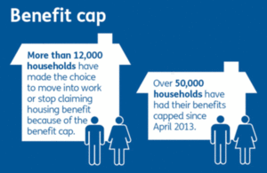
The infographic shows two houses. The house on the left is large and contains the text “More than 12,000 households have made the choice to move into work or stop claiming housing benefit because of the benefit cap”. The house on the right is smaller and contains the text “Over 50,000 households have had their benefits capped since April 2013”.
There are two problems here.
Firstly, the infographic claims that the benefit cap causes people to move into work. We have already seen how hard it is to confirm that a policy causes an outcome. As far as we know there was no clear evidence to confirm the claim.
Secondly, the house on the left represents 12,000 households. It is much larger than the house on the right which represents 50,000 households.
These points were picked up in a matter of hours by the press. The Daily Mail’s “ampp3d” team published a response in the online newspaper and on Twitter.

The ‘ampp3d’ infographic is titled “The benefit cap in numbers – the real version”. It also shows two houses. The house on the left is small and has text above it that reads “More than 12,000 households have made the choice to move into work or stop claiming housing benefit”. The house on the right is larger and contains the text “Over 50,000 households have had their benefits capped since April 2013”.
The size of the houses is proportional to the numbers they contain. The Daily Mirror has taken out “because of the benefit cap” .
The response was widely shared on social media. The positive message from the press release was lost in discussions about
- inappropriate use of graphics
- the clear difficulty of proving that the policy had caused the outcome
Even worse was the suggestion that the government were trying to mislead the public on purpose. An innocent explanation for the size of the houses might be that one is bigger than the other because it has more writing on it. But the authors had not thought about how people might interpret the image.
This example shows how important it is to get graphics right. Make sure your message is clear. It is a good idea to discuss presentation ideas for numbers with your analyst colleagues before you publish anything. This will help to reduce the risk of publishing a graphic that people might think is misleading.
Think about your message
Good statistical graphics, based on accurate statistics, help you to tell the stories in the numbers. They bring out the messages that really matter clearly and coherently.
Percentage of people immunised against diphtheria and MMR, England, 1991 to 2014

This line graph shows immunisation rates for diphtheria and Measles, Mumps and Rubella (MMR) in England since 1991. The immunisation rates are about 90% on average. There was a visible dip in the rate for MMR to 80% after 1998, but the level seems to be recovering. The chart is quite reassuring.
Here is a second chart showing a different view of the same statistics. We have zoomed in on the detail and labelled the graph to provide context.
Percentage of people immunised against diphtheria and MMR compared with the World Health Organisation (WHO) target, England, 1991 to 2014

Data on immunisation rates (ODS, 4.7KB).
The information in this chart is more worrying. You can clearly see the fall in the immunisation rate for MMR. The chart states that the fall is connected to a 1998 article in The Lancet by Wakefield and others which linked MMR to autism. The article was widely covered by the media. But the link the researchers found was shown to be wrong.
The diphtheria and MMR immunisation rates are below the WHO target minimum of 95%. 95% is the rate of immunisation that is needed to reach herd immunity. Both lines appear to be levelling off. The WHO target may not be achieved if these trends continue.
Both charts use the same data. By adding the extra context we have a better understanding of the situation.
Statistical graphics in government are increasingly self-contained. They try to tell the important stories in the data immediately.
An example from the Office for National Statistics demonstrates the point. Figure 4 on the page is a line chart that shows the number of homicides in the UK between 2003 and 2018.
The chart shows how the number of homicides fell almost every year between 2003 and 2014, but has increased in recent years.
The title sets out the main message to take from the chart. It says “Homicides have increased over the last four years following a long term downward trend. A more detailed subtitle explains that the data cover England and Wales and the time period.
The chart includes helpful labels with the lines on the chart. They point out events that explain sudden changes in the number of homicides. For example, the victims of the Hillsborough disaster were included in the homicide count in 2016, so it was much higher than normal. Giving context like this helps the reader to understand the data in the chart.
Updates
| Date | Changes |
|---|---|
| 2 February 2022 | Added the content from the PDF booklet to this page as HTML. |