Automated data visualisation best practice in R: afcharts release

What is afcharts?
afcharts is an R package for creating accessible charts. afcharts implements the Analysis Function data visualisation guidance.
What does afcharts do?
afcharts automates setting accessible colours, fonts and text sizing, axes labelling, and much more. Currently, functions are available for styling ggplot2 plots.
afcharts takes your charts from the ggplot2 defaults to an accessible Analysis Function theme in seconds!
Simply calling the “use afcharts()” function sets defaults for ggplot2 charts to the afcharts theme and colour palette.
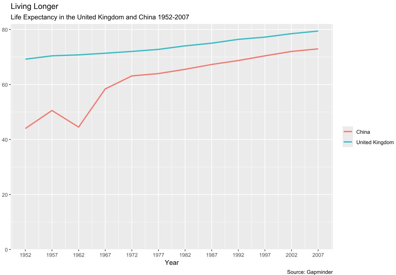
Figure 1: A line chart with default ggplot styling before using afcharts
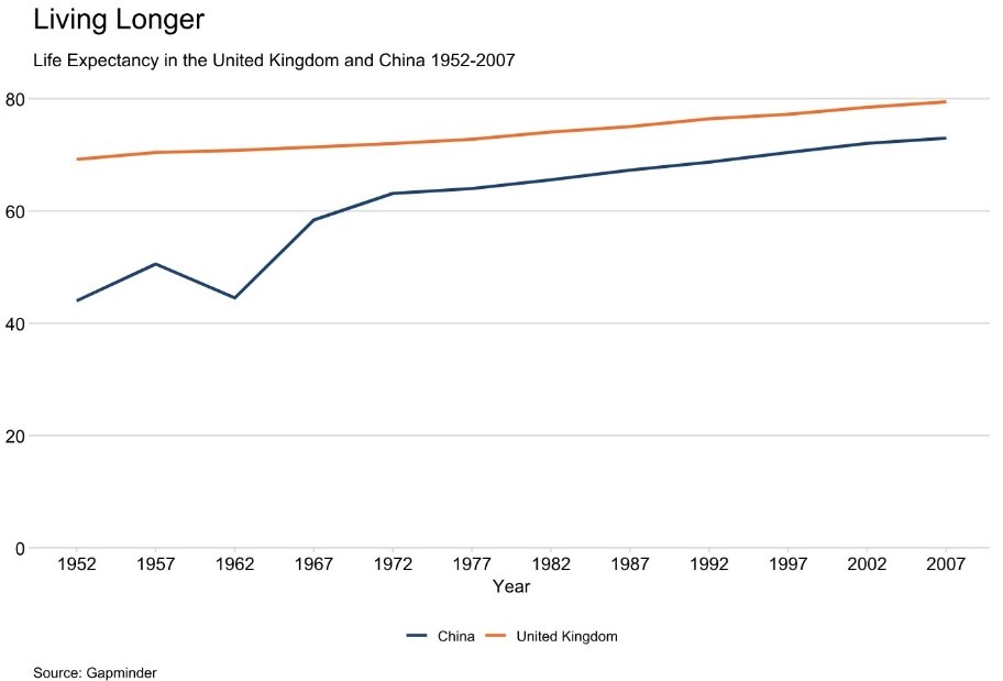
Figure 2: The same line chart after using afcharts now styled with the afcharts theme and colour palette
Figure 1 and figure 2 show the same line chart. Figure 1 shows ggplot2 default styling. Figure 2 shows styling with afcharts. The line chart styled with the afcharts theme uses the Analysis Function accessible colour palette, the recommended font formatting, has no background and only uses a minimal number of necessary gridlines on the y-axis.
And the best part is, your ggplots remain fully customisable. Besides all the customisation options already available with ggplot2, afcharts also supports customisation. The “theme af()” function has arguments to control the font size, legend position and appearance of grid lines, axis lines and axis ticks.
How do I use afcharts?
afcharts is available to be installed from the Comprehensive R Archive Network (CRAN):
`install.packages(‘afcharts’)`
The afcharts cookbook has everything you need to get started. You can find a broad range of examples covering different chart types.
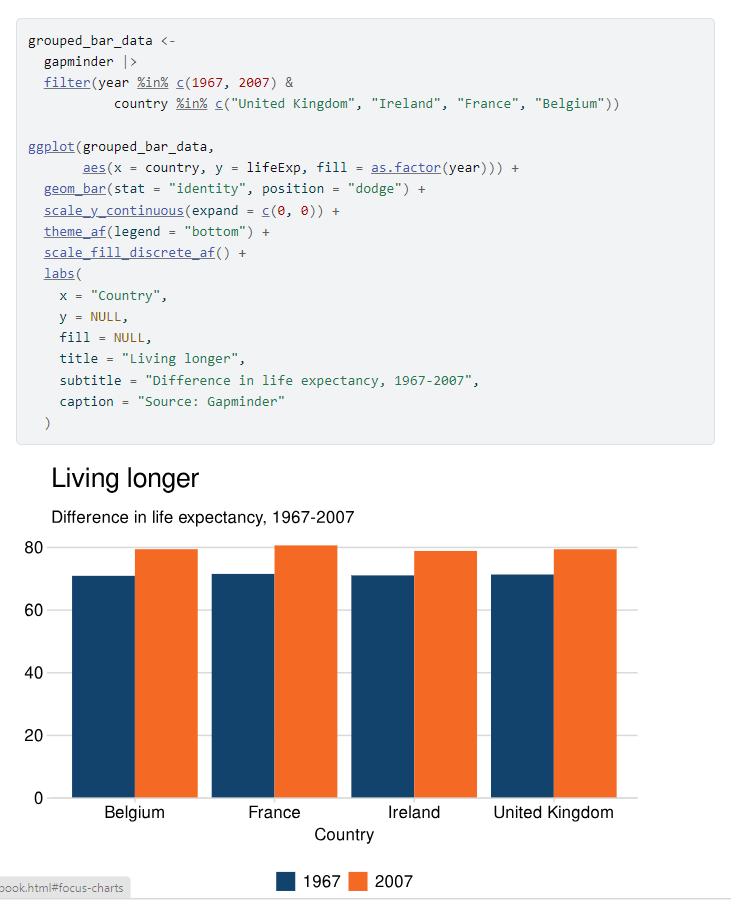
Figure 3: Example of a section from the afcharts cookbook
Figure 3 shows a section of the afcharts cookbook, under the subheading ‘Grouped Bar Chart’. You can access an accessible version of this grouped bar chart section on the Github website. It shows ggplot2 code including afcharts functions. Below, it shows the grouped bar chart produced by the code. The bar chart uses the Analysis Function accessible colour palette and recommended font formatting.
Who made afcharts?
afcharts is maintained by the GSS Presentation Champions.
afcharts was developed from Alice Hannah’s sgplot package for data visualisation in Scottish Government.
What’s next for afcharts?
We keep working to make afcharts better!
afcharts was first released on CRAN in November 2024. While the package focus is on static ggplot2 charts for now, we hope to expand functionality in the future.
How can I help make afcharts better?
If anything isn’t working, let us know and we’ll fix it. The best way to let us know is by raising an issue on the afcharts GitHub page.
We would be happy to welcome you on board of the afcharts development team. You can help us fix issues and add more features to afcharts.
What if I have more questions about afcharts?
We welcome any questions, feedback, or new ideas. Email PHA-OHID@dhsc.gov.uk with “GSS Presentation Champions: afcharts” in the subject line, or submit a github issue.


